Role
Product Designer
Creating a scalable mobile design system for Bank Saqu, then auditing it honestly to turn a strong token and component foundation into a system teams can trust, implement, and evolve.

Bank Saqu teams repeatedly rebuilt the same foundations and UI components whenever a product entered a new phase. The result was duplicated effort, visual drift, and decisions that lived in individual files instead of a shared system.
I created the design system to establish a reusable mobile foundation: variables, typography, icons, and core components that could support real product work without forcing every team to start from zero.
A later system audit showed an important truth: the technical foundation was ahead of the operating model. The layered tokens and primary masters were strong, while naming, accessibility assurance, documentation, and governance still needed focused work.
The challenge was not simply to draw a component library. It was to create a shared language that could remain useful as products, teams, and implementation needs changed.
Repeated setup work meant designers rebuilt familiar patterns instead of improving the product. Component variations grew around local needs without a consistent public API. Design decisions were difficult for engineering to map because token names had no platform code syntax. Accessibility behavior and interactive hit regions were not documented consistently.
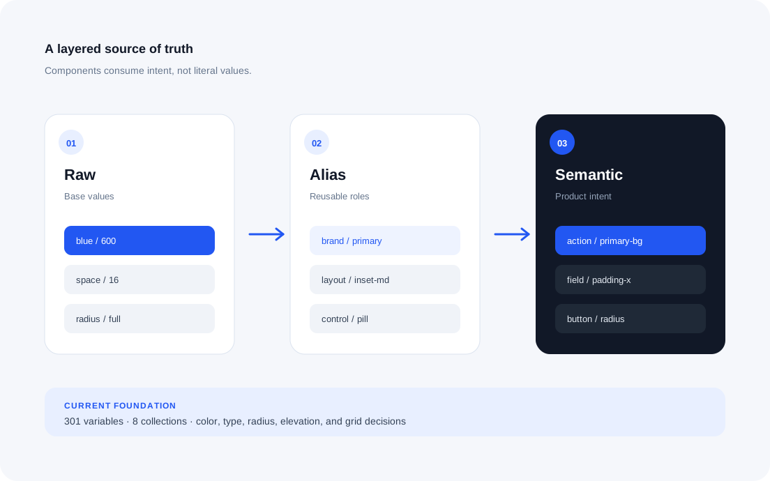
The design system uses a raw-to-alias-to-semantic model. For example, blue / 600 maps to brand / primary, which then powers action / primary-bg. The same pattern carries space / 16 into layout / inset-md and field / padding-x, while radius / full becomes control / pill and button / radius. Components consume intent instead of hardcoded values.
Across eight Figma collections, 301 variables cover color, typography, radius, elevation, and grid decisions. The layered structure protects product surfaces when a foundation value changes: the source is updated once, rather than corrected component by component.
Components sit on top of that foundation through Auto Layout, shared text styles, and bound variables. Textfield became the strongest reference because its property model exposes content, configuration, size, helper visibility, validation, and disabled behavior as a coherent state matrix.
The audit showed that this architecture should be refined, not replaced. The next pass adds explicit modes, tighter variable scopes, platform code syntax, and more predictable public component properties.

The strongest evidence is in the foundations. Sampled Button, Textfield, Top Navbar, and Checkbox masters use bound colors with no hardcoded color values. Auto Layout adoption is extensive and primary masters consistently consume the established text styles.
The gaps are equally clear. Search’s default placeholder measured approximately 1.53:1 contrast, below the 4.5:1 requirement for normal text. None of the 301 variables has platform code syntax, several high-use components mix hierarchy with interaction state, and seven of eight sampled component sets lack complete descriptions.
This places the design system at approximately 2.5 out of 5 in maturity: a strong technical foundation that still needs governance, accessibility assurance, documentation, and implementation parity.

First, protect product quality: fix Search contrast, document interactive hit regions, correct high-impact naming errors, and separate hierarchy, state, content, value, and configuration in Button, Toggle, Search, and Top Navbar.
Then make adoption sustainable: add meaningful modes and platform code syntax, simplify icon discovery, complete component guidance, and establish ownership, release, contribution, and deprecation practices.
The key lesson is that a large component count is not maturity. A design system is ready to scale when designers can choose the correct asset without tribal knowledge and engineers can map every public token and component property to implementation.